zigwheels website | cardekho
Zigwheels Car Model Page Revamp


Zigwheels.com, one of the flagship products of the CarDekho Group, has been a trusted name in the automotive space for years. However, recent discussions and analysis indicate a noticeable decline in impressions and visitor engagement on the platform. While there could be multiple contributing factors, one key observation is that the current design and user experience of Zigwheels.com appears outdated, potentially diminishing its appeal to modern users.
Objective
To revamping the website with a fresh, contemporary design that aligns with current digital trends. As modernized user interface and an intuitive user experience can significantly enhance engagement, improve performance metrics, and attract a larger audience.
Core Challange
To strike the right balance between a clean, minimal design and providing comprehensive information. Given the vast amount of data on Zigwheels.com, I had to ensure that users could quickly access key details without feeling overwhelmed.
Analyse and Empathize
Observing the existing UX issues
Conducted user behaviour analysis using heat-maps, session recordings, and analytics to understand pain points with the help of a tool "Browsee".
Reviewed competitor platforms to identify industry best practices and design trends.


Pain points
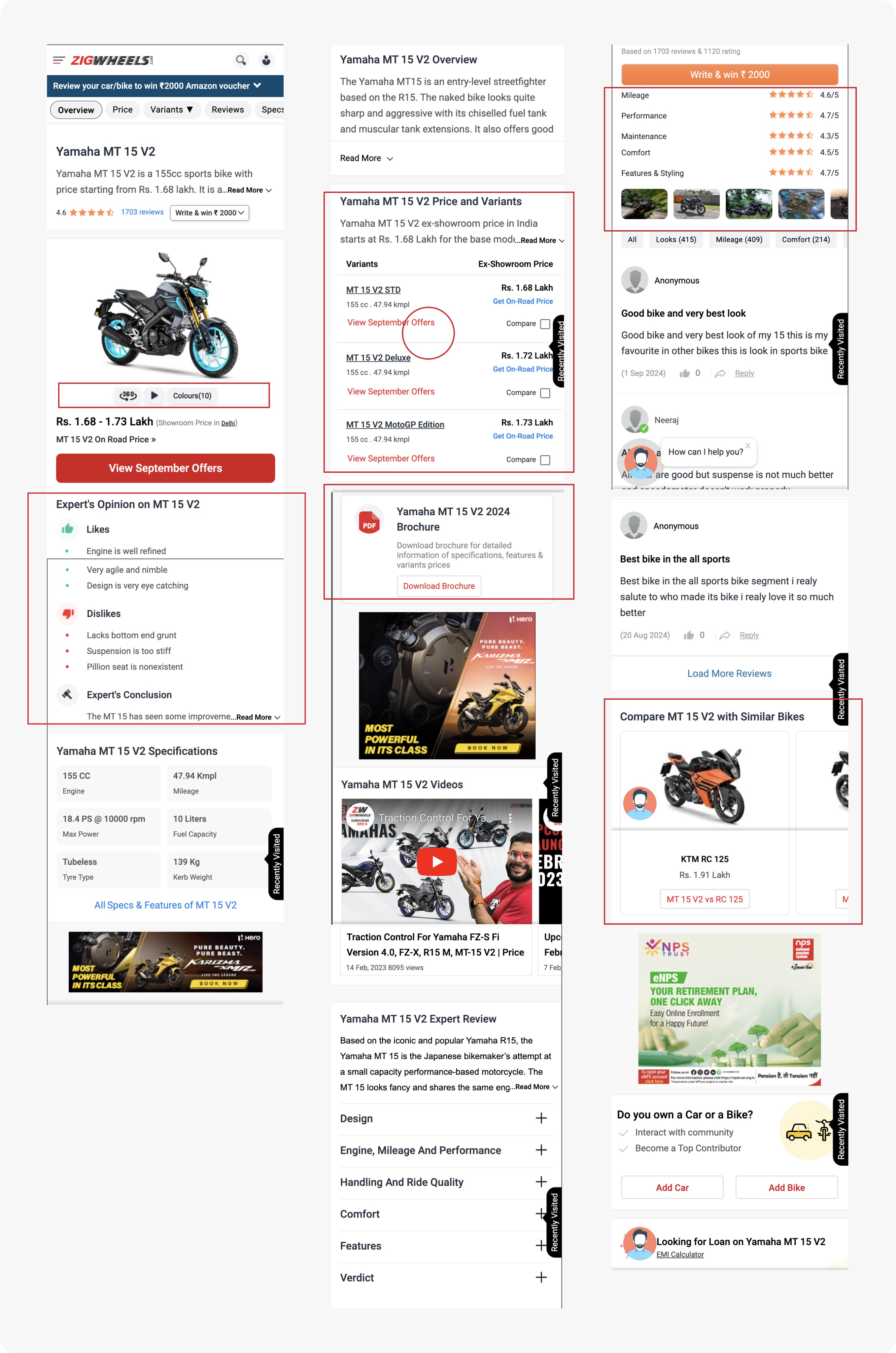
On observing closely to the existing design we identify many UI & UX issues. Here’s a list of pain points users faced in the old ZigWheels model page before the revamp:
Cluttered Above-The-Fold (ATF) Section
Too much information displayed at once, leading to cognitive overload.
Important elements like pricing, key specs, and CTA buttons were not easily scannable.
Poor Mobile Usability
Text and images were not optimized for mobile screens.
Excessive scrolling required to find relevant details.
Confusing Navigation & Information Hierarchy
Multiple CTAs (such as “View On-Road Price,” “Compare,” “EMI Calculator”) were competing for attention.
Users had to dig deep to find key specifications, reviews, or alternatives.
Inefficient Search & Filtering
Filters were either limited or not easily accessible.
Users struggled to compare similar models efficiently.
Lack of Trust-Building Elements
No strong social proof (e.g., expert reviews, user testimonials) visible upfront.
Safety ratings and ownership experiences were not highlighted effectively.
Define and Ideation


Low fidelity Wireframes

High fidelity Wireframes


Here, the outcomes that showed significant improvements in both impressions, user engagement and overall platform performance. Here are some key results:
Increased CTR
There was a significant increase in impressions and click-through rate (CTR) from the previous month to the latest month following the design launch.
Feedback
The new design received positive feedback for its clean, modern UI and improved user experience, making key information more accessible. However, heatmap analysis revealed that users instinctively tried to swipe through car images in the ATF section, indicating the need to reintroduce this interaction. Continuous refinements are being made to enhance engagement, navigation, and performance based on user behaviour insights.


